The place
kids want to bee.
A flexible, drop-in childcare brand built for busy parents — where screen-free play, hourly pricing, and a warm, beehive-bright identity do all the heavy lifting.
Make childcare feel like the place kids actually want to be.
Most childcare websites lean clinical — stock smiles, pastel gradients, checklists. The Hive needed the opposite: a brand parents could trust because it was warm, tactile, and unmistakably for kids.
Built around a hive.
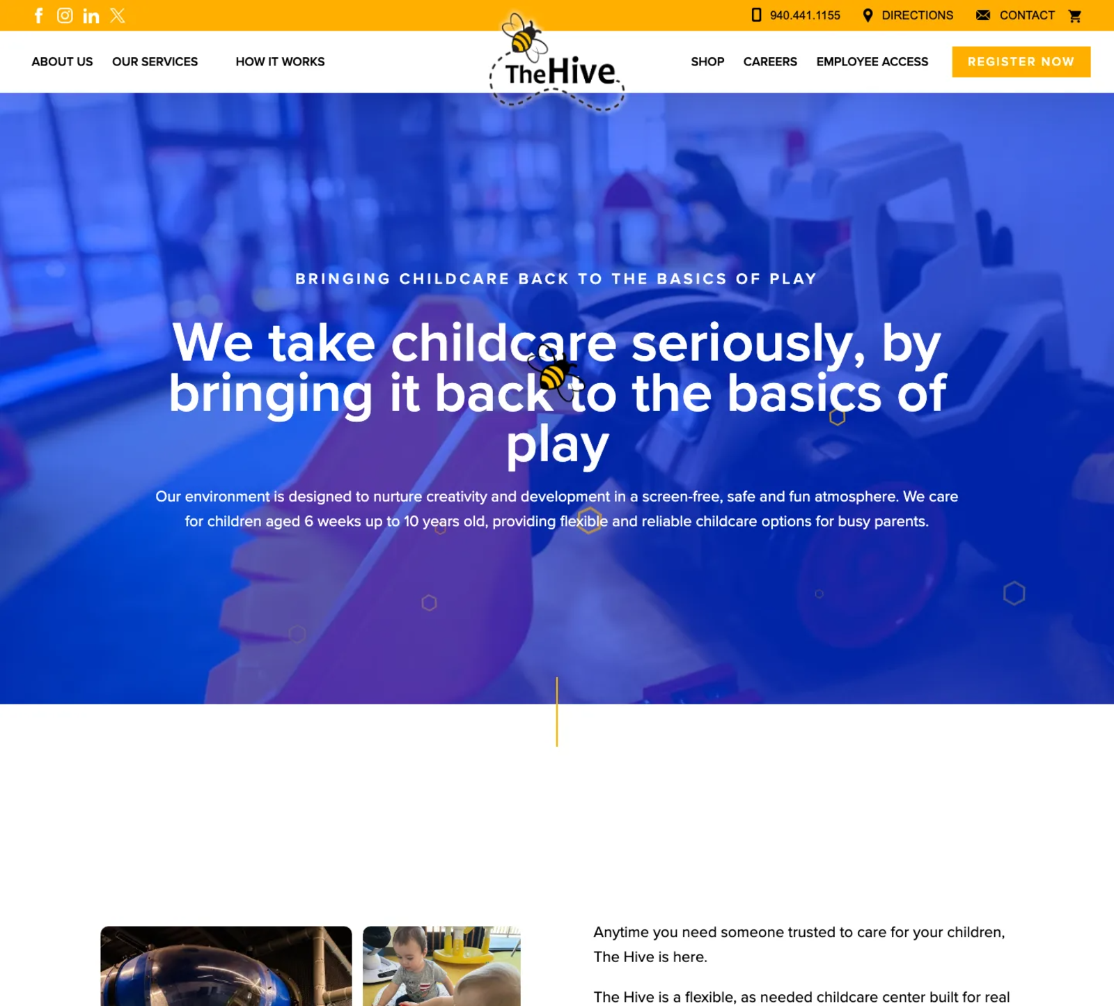
The whole system orbits one idea: a hive is busy, warm, social, and a little chaotic — exactly what good childcare looks like. The hex becomes a frame, a button shape, a divider. The bee shows up where it earns the smile.
Designed for the
9pm-bedtime parent.
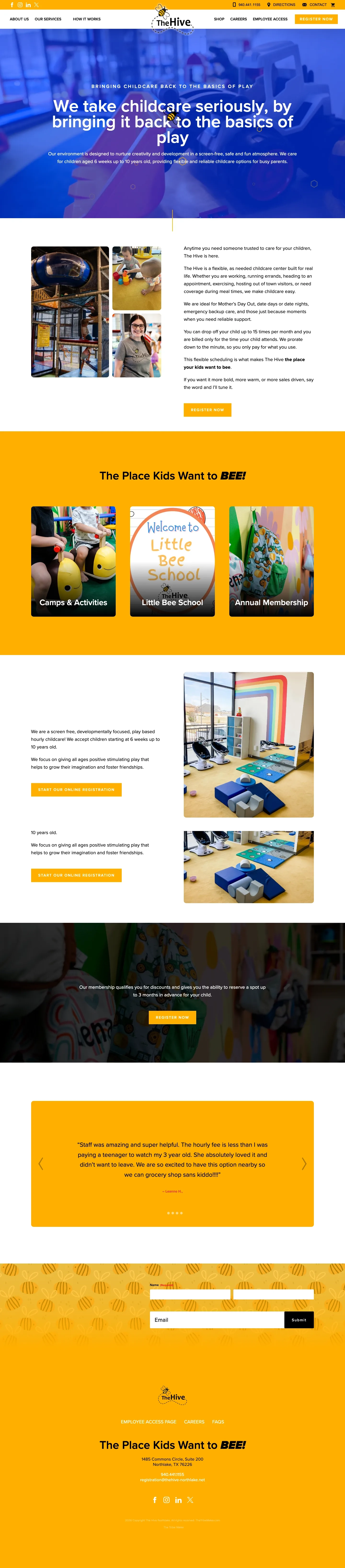
Most parents find The Hive at 9pm with a phone in one hand and a half-finished cup of tea in the other. Every page leads with the booking action — the rest waits patiently underneath.
The little things doing
the heavy lifting.
A hex-shaped CTA. A dotted line that reads as a bee's flight path. A pull-quote panel in honey yellow. The brand stays consistent without ever feeling rigid.
We wanted parents to feel the moment they landed on the page — these people get my kid. That's the whole brief, really.
One page,
start to sting.
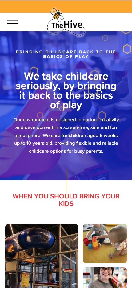
Hero → trust → programs → flexibility → testimonials → contact. A single scrollable narrative for parents who don't have time to click around.
playatthehive.com — drop-in childcare in Texas, built around hourly flexibility and a brand that warms up the room.
- Design DirectionStudio
- Brand & IdentityStudio
- Web DesignStudio
- PhotographyOn-site, The Hive